

Paper 002-2026 | Ted McNeil · BenZen Research · October 2026
About This Analysis
BenZen is a health-insurance media and technology company focused on how ACA Marketplace coverage works for people managing Type 2 diabetes. We work with public Marketplace plan data, carrier documents, and standardized coverage information to ask specific, checkable questions about how insurance benefits behave in practice.
This is our second published analysis. Paper 001 examined nine 2026 Marketplace plans in Dallas County, Texas. Paper 002 repeats that basic comparison in a second market: Fulton County, Georgia.
Like the first analysis, this work is exploratory, not peer-reviewed, and scoped narrowly on purpose. We publish our methodology and limitations alongside our findings so the work can be evaluated on its own terms. A different result from Dallas is not a failed replication. It helps define how cautiously the first result should be interpreted.
Abstract
This second exploratory analysis repeats the comparison from Paper 001 in a new market. It asks whether the relationship observed in Dallas between diabetes-oriented plan naming and the standardized “Managing Joe’s Type 2 Diabetes” coverage example from the Summary of Benefits and Coverage (SBC) appears again.
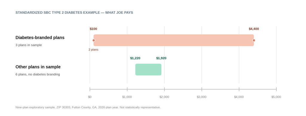
We examined nine 2026 individual-market plans available in ZIP 30303, Fulton County, Georgia, including three diabetes-branded plans. Patient responsibility in the standardized diabetes example ranged from $100 to $4,400. Diabetes-branded plans appeared at both ends: two CareSource diabetes plans reported $100, while Oscar’s diabetes-branded Silver plan reported $4,400.
The Georgia result does not reproduce the Dallas pattern. It suggests that a diabetes-oriented plan name, by itself, did not indicate how the standardized diabetes scenario would interact with a plan’s underlying benefit design. This analysis is exploratory and is not intended to rank plans or predict an individual’s healthcare costs.
Key Finding
In this Georgia sample, diabetes-branded plans appeared at both ends of the standardized Type 2 diabetes coverage example. Two CareSource diabetes plans reported $100 in patient responsibility, while Oscar’s diabetes-branded Silver plan reported $4,400.
The Georgia result does not reproduce the specific pattern observed in Dallas. Instead, it points to a narrower finding: a diabetes-oriented plan name, by itself, did not indicate how the standardized diabetes scenario would interact with the plan’s underlying benefit design.
The Question
Shopping for health insurance usually begins with a familiar set of numbers: monthly premium, deductible, out-of-pocket maximum, metal level, and perhaps copayments for common services.
For someone managing Type 2 diabetes, those numbers matter. Paper 001 asked what changes when another piece of standardized information is added: the “Managing Joe’s Type 2 Diabetes” coverage example contained in every Summary of Benefits and Coverage (SBC).
In the selected Dallas sample, every diabetes-branded plan produced a higher Joe responsibility than the lowest-cost conventionally named plan. But one market cannot tell us whether that pattern is common.
That raises the question for Paper 002:
If we repeat the same basic comparison in a second market, does the relationship observed in Dallas between diabetes-oriented plan naming and standardized Joe responsibility appear again?
We looked at nine 2026 ACA Marketplace plans available in ZIP 30303, Fulton County, Georgia, to find out.
What Is the SBC Diabetes Example?
Every Summary of Benefits and Coverage includes standardized coverage examples intended to help consumers compare how plan cost-sharing rules apply to defined healthcare scenarios.
One is “Managing Joe’s Type 2 Diabetes,” a standardized scenario involving routine in-network care for a well-controlled case of Type 2 diabetes. The example reports how much of the standardized scenario is attributed to the deductible, copayments, coinsurance, and limits or exclusions, followed by Joe’s total patient responsibility.
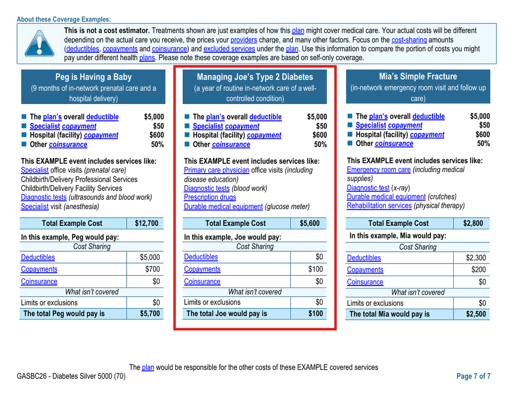
The Joe example as it appears in the CareSource Diabetes Silver SBC — the plan with the lowest standardized responsibility in this Georgia sample. Source: CareSource Georgia, 2026 SBC.
We use that number as a comparison measure. We do not interpret it as what a person enrolling in the plan will actually spend on diabetes care.
A real person’s expenses depend on the care they receive, their medications, providers, utilization, network status, and other plan rules. The SBC itself warns that its coverage examples are not cost estimators.
Our question is narrower: when the same standardized diabetes scenario appears across plan documents, what differences do those documents report?
How We Compared Plans
The working market was the 2026 individual ACA Marketplace available in ZIP 30303, Fulton County, Georgia.
As in Paper 001, this was an exploratory selected-plan comparison rather than an exhaustive ranking of every plan in the market. The cohort was assembled to include diabetes-branded plans and credible conventionally named alternatives across issuers, Gold and Silver metal levels, networks, and differing deductible structures. Comparator selection was frozen before the conventional Joe outcomes were reviewed, so plans would not be added or removed because their standardized result supported a preferred conclusion.
Three selected plans explicitly referenced diabetes or chronic diabetes care in their marketing names.
We used Georgia’s 2026 state plan files to match plan identifiers, service areas, plan attributes, and age-specific rates. Fulton County falls in Georgia Rating Area 3; service-area records confirmed Fulton County availability and, where applicable, ZIP 30303.
Cigna was considered during the initial market review because 2026 carrier materials referenced Fulton County, but it was excluded from the final cohort after it did not appear in the live 30303 Marketplace search used to reconcile the study market.
We used the gross monthly premium for a 40-year-old before premium tax credits as a consistent premium measure.
We verified the final standardized Joe values against the exact carrier SBCs. During quality review, the May 5 Georgia state Plans file contained earlier Joe fields for the two CareSource diabetes plans that differed from the current exact carrier SBCs — $400 for the Gold plan and $500 for the Silver plan, versus $100 for each in the current SBCs. We use the current carrier SBC values in this analysis and retain the earlier figures in the research audit trail rather than silently reconciling them.
What We Found
| Plan | Diabetes-branded | Metal | Age-40 premium | Medical deductible | Joe pays |
|---|---|---|---|---|---|
| Kaiser Permanente KP GA Signature Gold HMO $500 $20 | No | Gold | $708.12 | $500 | $1,530 |
| Anthem Gold Blue Value HMO 2550 | No | Gold | $724.63 | $2,550 | $1,220 |
| Oscar Silver Simple Diabetes HMO $6500 $0 | Yes | Silver | $724.83 | $6,500 | $4,400 |
| Oscar Silver Simple HMO $5000 $20 | No | Silver | $727.36 | $5,000 | $1,900 |
| CareSource Diabetes Silver HMO 5000 | Yes | Silver | $866.91 | $5,000 | $100 |
| Anthem Gold Pathway Guided Access HMO 1350 | No | Gold | $891.28 | $1,350 | $1,920 |
| Ambetter Elite Gold HMO $0 $5 | No | Gold | $948.94 | $0 | $1,320 |
| CareSource Diabetes Gold HMO 3000 | Yes | Gold | $985.66 | $3,000 | $100 |
| CareSource Core Gold HMO 1500 $20 | No | Gold | $1,032.15 | $1,500 | $1,700 |
Sorted by gross age-40 monthly premium — the order a consumer typically encounters while shopping. Premiums are before premium tax credits. Joe values are standardized SBC comparison examples, not estimates of an individual’s actual spending.
Read left to right, in shopping order: the third-lowest-premium plan in the sample has the highest Joe responsibility in the standardized diabetes example. The two lowest standardized results belong to plans with two of the higher premiums in the sample.
The immediate result is not that one of these plans is the “best” plan for diabetes. It is that the picture changes depending on what information we look at — and this time, the diabetes-branded plans themselves do not agree with each other.
The Headline Finding: Diabetes-Branded Plans Landed at Both Extremes
Three plans in this sample explicitly reference diabetes in their marketing names. Here is what Joe pays under each, in the standardized diabetes example:
- CareSource Diabetes Silver HMO 5000 — $100
- CareSource Diabetes Gold HMO 3000 — $100
- Oscar Silver Simple Diabetes HMO $6500 $0 — $4,400
The six conventionally named plans in the sample ranged from $1,220 to $1,920 — between the two diabetes-branded extremes.
That is a different picture from Dallas. In Paper 001, all four diabetes-branded plans landed above the lowest-cost conventional plan. In Georgia, diabetes-branded plans hold both the lowest and the highest standardized Joe responsibility in the sample.
Put plainly: within this selected sample, the diabetes label appears on plans producing both the lowest and the highest standardized Joe responsibility. A diabetes-oriented name did not, by itself, indicate how the standardized diabetes scenario would interact with the underlying benefit design.
Premium Doesn’t Resolve the Difference
Oscar Silver Simple Diabetes sits near the low-premium end of the selected cohort at $724.83 per month before premium tax credits. Its standardized Joe responsibility is $4,400.
CareSource Diabetes Silver costs $866.91 per month and reports $100 in Joe responsibility. CareSource Diabetes Gold costs $985.66 per month and also reports $100.
The two CareSource diabetes plans therefore have meaningfully different gross premiums but the same standardized Joe result. Meanwhile, the similarly low-premium Oscar diabetes plan produces a dramatically different standardized result.
Premium is not unimportant. It answers a different question: what maintaining the coverage costs before subsidies. It does not, by itself, show how a standardized set of diabetes services moves through the plan’s cost-sharing rules.
The Headline Deductible Can Tell a Very Different Story
CareSource Diabetes Silver provides the clearest example.
The plan has a $5,000 individual medical deductible. Yet in the current SBC’s standardized Joe example, Joe pays $0 toward the deductible and $100 in copayments, for $100 total responsibility.
CareSource Diabetes Gold has a $3,000 individual medical deductible and produces the same $100 Joe total.
Compare that with CareSource Core Gold, a conventionally named plan from the same carrier. Its headline medical deductible is lower, at $1,500 — but its standardized Joe responsibility is $1,700.
The point is not that one CareSource plan is better for an individual consumer. It is that the headline deductible and the standardized diabetes example are describing different aspects of the plan.
The same pattern appears elsewhere. Ambetter Elite Gold has a $0 headline medical deductible, yet its standardized Joe responsibility is $1,320.
A deductible remains important plan information. But in this selected cohort, its headline amount does not by itself explain how the routine diabetes care represented by Joe is treated.
Metal Level Doesn’t Settle It Either
Among the selected Gold plans, Joe responsibility ranges from $100 under CareSource Diabetes Gold to $1,920 under Anthem Gold Pathway Guided Access. Both are Gold plans.
The selected Silver diabetes plans diverge even more sharply. CareSource Diabetes Silver reports $100 in Joe responsibility. Oscar Silver Simple Diabetes reports $4,400.
Metal level remains useful information about a plan’s overall actuarial structure. The Georgia comparison simply shows that it does not substitute for examining how the plan treats a particular standardized care scenario.
What Changed When We Moved From Texas to Georgia
Paper 001 asked whether diabetes-oriented plan naming identified the same plans that looked attractive after the standardized diabetes example was added.
In the selected Dallas sample, it did not. None of the diabetes-branded plans had the lowest Joe responsibility.
If Georgia had produced the same pattern, it would have been tempting to focus the research series on diabetes branding.
It did not. Georgia instead produced diabetes-branded plans at both extremes of the Joe distribution.
That difference matters.
Dallas was not wrong. It accurately described Dallas.
What Georgia tells us is that the Dallas branding pattern is not something to generalize from two markets. At the same time, it strengthens a different observation that now appears in both exploratory comparisons: commonly emphasized plan characteristics — premium, deductible, metal level, plan name — do not fully describe what the standardized diabetes example reveals.
Premium tells us one thing. The deductible tells us another. Metal level tells us something broader about actuarial structure. A diabetes-oriented name tells us something about how a carrier has designed or marketed the product. The standardized Joe example gives us another view entirely: how the plan’s cost-sharing rules apply to the same defined diabetes-care scenario.
Those views are not interchangeable.
What It Means During Open Enrollment
The practical lesson is not that consumers should choose the plan with the lowest Joe number. Joe is not a forecast of an individual’s expenses, and the example does not capture every factor that matters when choosing coverage. It does not tell us whether a person’s particular medications are covered, what formulary tier they occupy, whether prior authorization applies, whether a physician or endocrinologist is in network, or what services that person will actually use.
Instead, the Georgia comparison reinforces the value of showing consumers more than one layer of plan information.
A $5,000 deductible can coexist with $0 of deductible responsibility in the standardized diabetes example. A diabetes-branded plan can produce $100 in the example. Another diabetes-branded plan can produce $4,400. Those are not predictions about what an enrollee will spend. They are differences reported by standardized plan documents under the same comparison framework.
The information already exists. The question is whether it is being connected and surfaced in a way that helps consumers understand what the headline numbers do — and do not — tell them.
Limitations
This is a small exploratory analysis and should be interpreted accordingly.
The nine plans were deliberately selected to compare contrasting plan designs. They are not a statistically representative sample of every Marketplace plan in Fulton County, Georgia, or the United States.
The standardized Joe example represents one defined pattern of routine care for a well-controlled case of Type 2 diabetes. It does not represent every person with diabetes or every pattern of healthcare use. Joe is not a cost estimator, and the values reported in this paper should not be interpreted as what a consumer will spend after enrolling in a particular plan.
This analysis does not determine whether an individual’s specific medications are covered, their formulary tiers, prior-authorization requirements, provider-network participation, disease-management services, or actual annual healthcare spending.
The diabetes-branding comparison is also narrow. Three selected plans explicitly reference diabetes or chronic diabetes care. That is too small a group to establish a general relationship between plan naming and benefit quality.
Marketplace information can change, and related plan variants can differ. We used Georgia state plan, service-area, and rate files to reconcile the market and exact plan identifiers, then used carrier SBCs as the final source for the standardized Joe examples. One source discrepancy deserves specific mention: the May 5 Georgia state Plans file contained earlier standardized Joe fields of $400 for CareSource Diabetes Gold and $500 for CareSource Diabetes Silver. The current exact carrier SBCs report $100 for each. We use the current carrier SBC values in this analysis and retain the earlier values in the audit trail rather than silently reconciling them.
Finally, Dallas and Georgia are two exploratory markets. Differences between them should not be interpreted as evidence of a state effect, carrier effect, or causal relationship.
Those are limitations of this analysis. They are also part of the problem we are interested in studying.
A Note on the Analysis
This is BenZen’s second published insurance-data analysis.
We made reasonable efforts to match the selected plans to the appropriate 2026 market, service-area, rate, plan, and SBC information. Where our research uncovered an identifier or source discrepancy, we documented and reconciled it before locking the analytic cohort.
The standardized diabetes examples discussed here are not predictions of an individual’s healthcare expenses and are not recommendations to enroll in a particular health plan. They are a standardized comparison tool already contained in plan documents. Our purpose is to examine what becomes visible when that information is connected to the plan characteristics consumers commonly encounter while shopping.
What We’re Asking Next
Georgia changed the question.
The next question is no longer simply whether diabetes-branded plans produce higher or lower standardized Joe responsibility. It is why plans produce such different results under the same standardized diabetes scenario.
Why does a plan with a $5,000 headline medical deductible attribute $0 of Joe’s responsibility to the deductible? Why do two diabetes-branded Silver plans report $100 and $4,400 under the same standardized scenario? Which parts of the benefit design — deductible applicability, copayments, prescription benefits, laboratory services, office visits, or other cost-sharing rules — are driving those differences?
Those questions can be tested by moving underneath the headline plan characteristics and examining the benefit architecture itself.
For now, the conclusion is narrower:
In this exploratory comparison of nine 2026 Marketplace plans available in ZIP 30303, Fulton County, Georgia, the diabetes-branded plans appeared at both the lowest and highest ends of the standardized Type 2 diabetes coverage example. Adding the SBC example revealed differences that premium, metal level, headline deductible, and plan naming did not explain on their own.
That is not a prediction of what a person with diabetes will spend. It is what the standardized plan documents showed when we asked the same question in a second market.
Methodology & Sources
Market: ZIP 30303, Fulton County, GA · Plan year: 2026 · Plans analyzed: 9 · Premium basis: age 40, unsubsidized, Georgia Rating Area 3 · Primary sources: Georgia Marketplace plan/benefit/rate/service-area files + carrier SBCs · Analysis: BenZen
Primary sources referenced in this analysis:
- CMS — 2026 State-based Exchange Public Use Files (Georgia)
- Kaiser Permanente SBC — KP GA Signature Gold HMO $500 $20
- Anthem SBC — Gold Blue Value HMO 2550
- Oscar SBC — Silver Simple Diabetes HMO $6500 $0
- Oscar SBC forms index — Silver Simple HMO $5000 $20 (public carrier forms index; no unverified direct PDF URL available)
- CareSource SBC — Diabetes Silver HMO 5000
- Anthem SBC — Gold Pathway Guided Access HMO 1350
- Ambetter/Centene SBC — Elite Gold HMO $0 $5
- CareSource SBC — Diabetes Gold HMO 3000
- CareSource SBC — Core Gold HMO 1500 $20
Source note: Carrier SBCs are the final source for the standardized Joe values used in this paper. Georgia state files were used to reconcile plan attributes, rates, service areas, and market eligibility.
About BenZen Research
BenZen Research examines how health insurance works for people managing diabetes using publicly available Marketplace data, carrier documents, formularies, and other insurance information.
Our analysis is independent and non-peer-reviewed. This research is educational and does not recommend a particular health plan or predict an individual’s healthcare costs. Source information can change. Material corrections will be noted on the applicable research page.
Questions, source corrections, or data discrepancies can be submitted here.
BenZen is a registered trademark of Health Benefits, LLC.